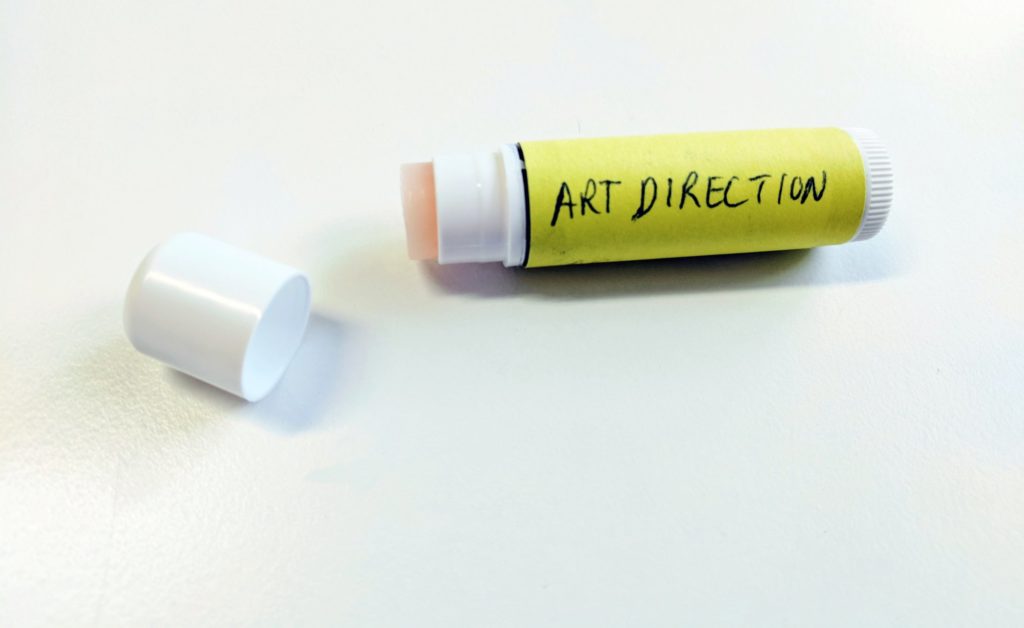
Advice I gave today: “Sometimes the idea can be simple and the art direction direct. Too often good art directors bury good ideas with lipstick.”
Lipstick on a pig.
A saying that has been tracked back in written form as early as 1940’s when in a book by English Author Stella Gibbons Westwood. Though the idea has been around much longer. In fact, there is a whole wikipedia page dedicated to the phrase for those of you with internet curiosities into useless information (like myself).
Well today, I without thinking used my own odd version of it in reference to simplicity with one of our staff. It was not in reaction to any particular work being reviewed or idea being vetted. Just a caution after a brief of a large multi-phase project we are starting and some of the accompanying elements to make sure that the end goal and action for the people who will experience it are clear in what we are expecting from them, communicating to them and ultimately what we hope to get out of it ourselves from their experiences. To make sure we don’t fall down the so common rabbit hole of art director overkill.
But after I said it I couldn’t stop thinking about it. How many times does form in the end still overpower function or reason? Why are we so programmed – as the people who are ultimately responsible to push the pixel, obsess over the font and colour, stay away at night over if the art direction is original enough or not – to ignore the power of doing less with our initial thinking?
For over fifteen years I’ve been guilty of what I cautioned against. And though it may have been half to the talented art director as much as it was a self-reminder for when I look at the concepts that will no doubt be developed over the next week – it is something we seem to drown ourselves in. Crafting an idea and obsessing over it consumes us. Maybe it is an addiction of sorts that we can’t wait to enjoy again. So much so that often right out of the gate no matter how clear the brief we will instantly go for the grandiose approach. Instead of starting simple and building on to the complexity – similar to how you would code a new software or draft out a novel as a treatment.
Yet in those years I can say that Art Directors are often the first to get trapped by a big vision before you’ve given yourself time to build a base to support that vision.
So, I throw the idea and question back to all you fellow Art Directors, Designers, Creatives – why do you think we get lost in visuals and “lipstick” before we made something more than an ugly pig beneath it?
Here are a of my (always-work-in-progress) habits against this Art Director Curse:
- Idea boot camp. I still try to ideate in blasts of 60-90 minutes with forced breaks
- I don’t share beyond the group until there is substance and I have given myself time to think, digest and mull it over.
- I force process and steps in projects even when people hate it so we are all accountable and focused
- I do write and review briefs, but I tend instead to right “Requirements”. Whether it’s a creative project, a tech build, a feature list, a copy writing task…I still prefer to list a task or document as Requirements and bullet form out everything that is needed whether it is to simply say a logo, a language, a form and its fields, a creative direction or feature…doesn’t matter. I list it out. That is my go to check myself and see “Ok, it’s a cool idea and will look great, but does it really do the job?”
- I force myself to take breaks and walk around, think on other things, stare off into space. I still look at things by closing my eyes for a few seconds and opening to see where my eye goes first. And I am trying as I get older to do the same thing with my mind. We all think too fast and decide on an idea too fast. To pause…and let my mind float and find another place to look…
What are your approaches, processes and habits you’ve developed or learned to avoid the pitfalls?
