Originally published on Linkedin.
They are a discovery tool. You can always burn them.
This happened today – a small reminder to not get stuck in your own process or tools.
We have spent the last month looking at what to do with our website at Vicimus. What we have is fine, but a bit bland and light on content.
We have spent our time as we often do in exploration. First our user flows and hierarchy of pages we want based on moving to a better product/industry content resources structure. Then moving into grey box wires. It’s very typical and to be expected. However that work is all but gone now.
Often in UX you get stuck in process and rules and being disciplined. You get drowned by it and in the end you have very functional nice design that will be easy to develop but is…well…boring, expected, safe or worse expected.
Earlier this year I spent a long time making a competitive research deck dismantling their sites, social channels, branding, advertising, key messages and pillars. Looking at other SaaS automotive vendors. This led into our initial more rigid wires, content and strategy. Then as we would typically do in design…we started to make the design layer over those wires and explore a bit within a sandbox we had already locked ourselves in. So with each iteration of the design and sharing with internal stake holders and team leads we found ourselves stuck and uninspired. That inevitably leads to design explorations and moving far from the original intent each round until you are lost. Our wires were ultimately useless. We then moved into design inspiration and visual engagement explorations and have continued to explore…lost in the sea…floating around.
Discovery…
Then today while talking with our CEO about the struggle and bouncing ideas back and forth we came full circle back to what we had forgotten. We want to tell a story and drive product and brand awareness equally – and do it in a memorable and engaging fashion. How could we forget this?!?!?
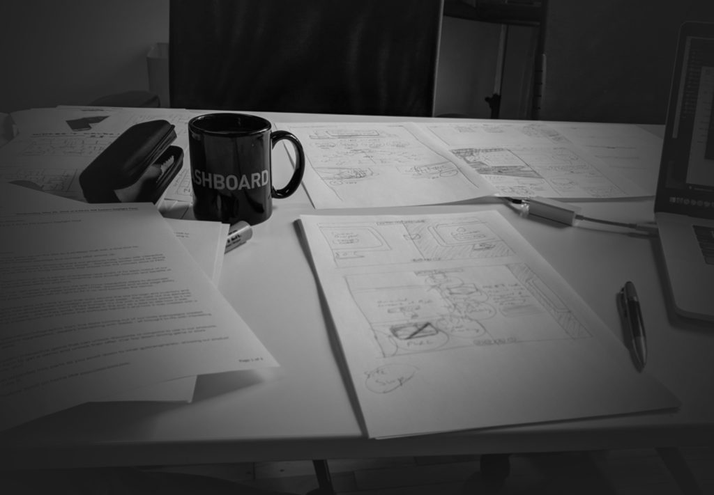
So we ended up scribbling ideas which then led to me doing a new more conceptual wire/structure of story telling with pen and paper (my favourite tool…i love Draw.io and sketch and all the fancy tools…but pen and paper always win).
As my Art Directors know – I am rarely satisfied and always looking at changing things – so luckily they expect now that I will push it until it FEELS right. Not until it just checks boxes. And our new approach feels right. So after that conversation with the art director on the project, showed him that vision and reminded him of our core purpose – tell a story. Forget about the details for now.
I am excited to see where he lands – and in a couple months whenever we relaunch our site and the evolution of the idea – I’ll be excited to see it live.
But in the mean time it was a refreshing reminder that your gut knows best. When you feel like it’s not right and the process is holding you back you have to break away from it and re-organize your brain for the true purpose. It can be a hard break when you are the guy who write and manages the process as I do…
Designers…UX pros…wire masters…DON’T let your own process and tools become your crutch. It’s okay to deviate and reset. Risk is worth it.
Thought I’d share today’s story.
*****
About The Author
Todd Lawson has worked as an gallery artist, commercial artist and a creative leader in advertising, design, illustration, CGI, publishing industries and software product design. As well as a leader in the automotive marketing space since 2002, Todd has been fortunate to have done some great work, worked with some great people and been recognized globally for it. He works with companies at all levels of development to lead, mentor, ideate, grow teams, guide projects, face to face interaction with clients, partner with vendors, seek out new technology and trends, plan and execute. See artwork, marketing projects and more articles at ToddLawson.com.
